Culture
Product
Step-By-Step Tutorial on Google Data Studio
May 3, 2019
Product
May 3, 2019
Every marketer and advertiser will tell you that efficient data collection and analysis is key to the success of current and future social campaigns. In order to justify a new idea for a campaign or to analyse the success and performance of a previous campaign, data plays an incredibly important role. However, collecting and analysing your data in a clear and effective way has proven to be a tricky task for many advertisers. That’s where Google Data Studio comes into the mix.
Google Data Studio is a free data visualisation tool that allows you to create clear and engaging data reports from a plethora of sources such as Google Analytics, Google Sheets, Google Search Console, YouTube and much more!
It helps you produce reports that are easy to understand, enabling you to gain key insights from your data and performances with great precision and accuracy. Data Studio also offers advertisers the opportunity to visualise their data in a variety of ways including charts, graphs, bar charts, tables, heat maps, scorecards, area charts and lots more.
Furthermore, this impressive tool will also allow you to fully customise your data reports and dashboards aesthetic preferences. You can change your reports’ background, fonts, images, objects and other customisable features, so that your data reports and dashboards are completely tailored to your desires.
Don’t feel like designing your own report or dashboard? No problem, Data Studio also offers pre-built customisable templates that you can leverage in order to quickly get to work with an easily set up report or dashboard.
There’s also the possibility to share your report or dashboard with a member of your team, giving you the chance to collaborate on the data collection and analysis process.
To begin, visit datastudio.google.com and sign in with the same account that you use to log in to Google Analytics. Here’s what your Google Data Studio portal will look like. At the top you’ll find previously created reports that you can continue working on or the option to make from scratch. Check out the menu bar on the left in order to access the Reports & Data Sources sections and more.
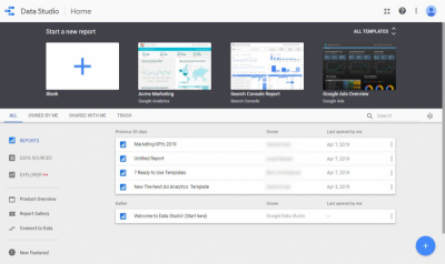
As can be seen in the image above, you can easily create a new report by clicking on the white box with the ‘+’ sign on it. Once you have selected this option, an empty white page will appear.
If you wish to quickly create a data report from Google Analytics, Search Console, Google Ads, Youtube Analytics, Google Sheets, a combination of Google Analytics & Google Ads or Google BigQuery, you can use one of the Data Studio’s pre-built customisable report templates.
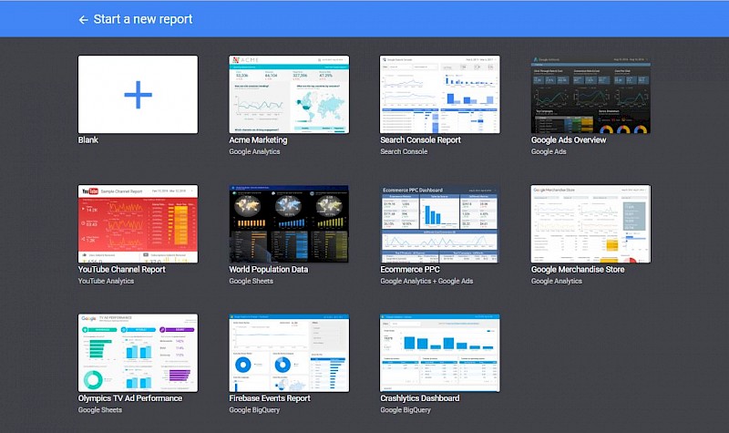
Once you’ve selected your report, click on the ‘Create New Data Source’ button. This will enable you to connect your report to over 18 Google data sources as well as 135 partner data sources.
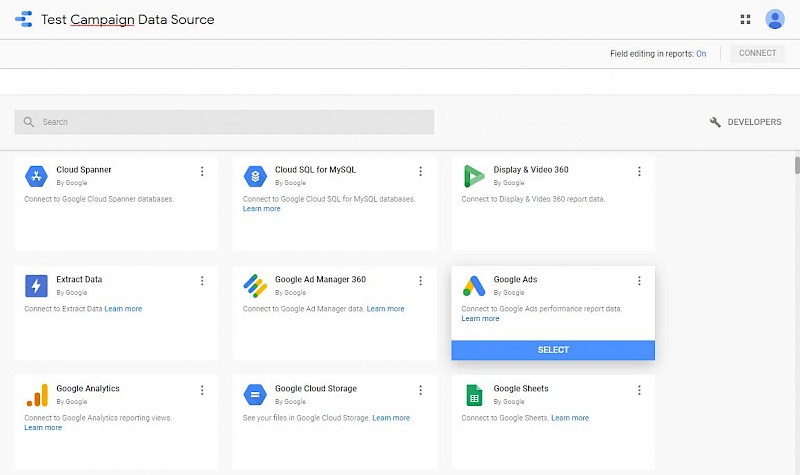
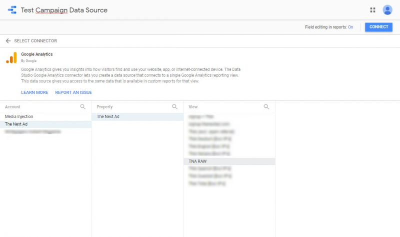
After selecting your desired Data Source, you’ll need to connect it to your Google Data Studio account. For example, if for this report you would like to visualise some Google Analytics data, connect your Analytics account to your Data Studio. When you’ve done this, you’ll be able to select your account, property and view, as can be seen in the image below.
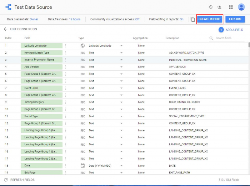
In the next step, a spreadsheet of fields and/or metrics that your Data Source is tracking, in this case Google Analytics, will appear. If there is a particular field you would like to add, click on the ‘Add A Field’ button. When you’re ready to proceed, press on the ‘Create Report’ button.
Once you’ve created your report, you’ll see that an empty, blank grid appears which you can use to add different kinds of visualisations to. However, before you start adding your data visualisation onto the report, you may want to begin by customising your layout, theme and design according to your preferences.
Is one Data Source not enough and is there a need to add another one to your report? No problem, just click on the Resources tab on the menu bar at the top of your screen and then select the ‘Manage added data sources’ option. Then just click on ‘Add a Data Source’ and choose the Data Source you would also like to connect to your account (e.g. Google Ads or Youtube Analytics).
This is where it starts to get interesting.
Google Data Studio offers a myriad of different options and designs in which you can visualise your collected data. As has already been mentioned, there are dozens of different options including pie charts, graphs, tables, scatter charts and a lot more.
Want to add some text or images to your report? That’s also easily possible.
To pick your visualisation method, click on ‘Insert’ on the top menu bar and select the type that you want your data to be presented in. You’ll see that once you’ve added your visualisation, you can enlarge or make it smaller by dragging it from one of the corners. You can also position it wherever you want.
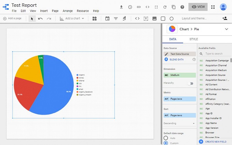
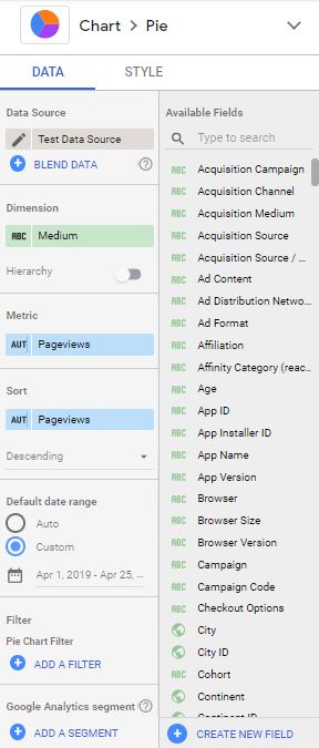
Now that you’ve selected your type of visualisation, it’s time to edit the data source, dimension, metric and data range. In addition to these settings, you can also sort your data in a particular order, filter your data and edit the visualisation’s style and layout.
And that’s it! Want to create more visualisations for your report? Go wild! Add as many as you want using different kinds of visualisation methods in order to create an appealing report that is pleasant on the eye and clear enough to understand and draw key insights from.
It may seem a tad complicated at first, but we guarantee that once you’ve familiarised yourself with Google Data Studio a bit, you’ll start loving this data visualising tool as much as us!
Did you know that The Next Ad customers and partners have free access to our integrated analytics software called The Next Ad Analytics?
This tool will help you create detailed reports and dashboards with the data that you have collected from campaigns that you are running on The Next Ad. Leverage this tool to gain key insights on your recent social ad campaign performances.
With the user-friendly, real-time reporting dashboards of The Next Ad, you will be able to benchmark your data in the most efficient way possible and customise templates according to your personal preferences.